Saturday 24 January 2015

Theorists


Roland Barthes' theory of myth relates to my group tour poster. He believed that there are a widely accepted chain of concepts, throughout culture used to aid understanding of experiences. This relates to my media products as I had to consider this theory when creating the structure of the media product. This because there are certain concepts in the indie rock culture that I needed to apply to my products, to allow the audience to perceive the product as belonging to the indie rock genre.

This also relates Barthes' theory to Reception theory, as the success of my media products is massively dependent on audience perception. Stuart Hall identified three types of audience decoding:

  • Dominant/Preferred
  • Negotiated
  • Oppositional
My products applies to the dominant/preferred denotation, this is because the preferred indie genre concepts need to be evident and visible on my media product to allow the target audience to identify with it. There are indie rock conventions that I ensured were applied to my work.

The Mise En Scene elements which are conventions to the indie rock genre is lighting. The lighting is utilised to enhance the mood of the media product, as the music video is dull and bleak because of the narrative, this is why the lighting is relatively dark.

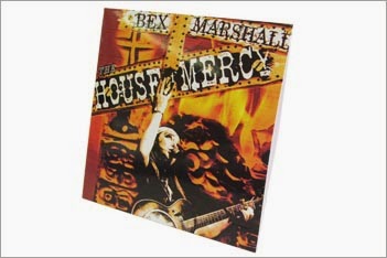
This is the same with the colour scheme other indie rock artists use colours to represent the mood/theme of the song. This is evident through the black and white theme implemented throughout all of my media products to integrate conventions of the indie rock genre into my work.

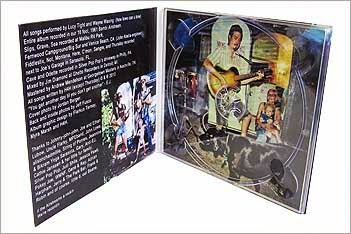
There are borders around both of the products so that the text and the images are not too close to the edge of the products. This is something that it used by all designers of media products as it allows the piece to breath and adds depth to the product.

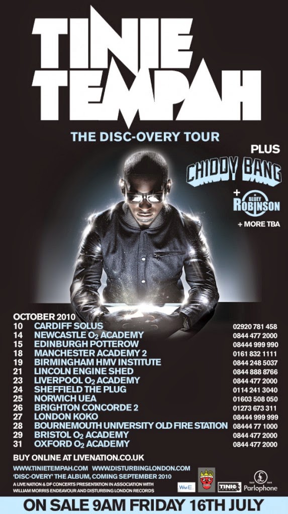
In relation to the camera work a convention of the genre is close-ups. This is to represent the emotions that the song are portraying through the facial expressions of the artist. As you can see on both the tour poster and the CD packaging, because I played the role of the artist I made sure that my facial expressions portrayed the emotions of the song.

Tuesday 20 January 2015

Final music video and reasons behind decisions


This is the final music video for our group. We have applied a few minor changes to the prior version and are now fully satisfied, we have done all we can do to make the music video.

Reasons

Black and white theme: The black and white theme is something that we have implemented across all our products. The theme has a symbolic purpose. The song has a bleak meaning behind it and we explored this and found the theme was the best way to emphasise this.

The artist is going through his own personal turmoil and the black and white theme helps make the world look bleak and desolate. So this display of emotion is demonstrated through the black and white theme.

Camera angles and shots:
  • Opening shot: This has been chosen as it shows (using an over-the-shoulder shot) the landscape. This contrasts with the artist and makes the artist look insignificant which is a recurring motif throughout the music video.
  • First two shots: The long shot of the artist walking away and to the camera was inspired from Ed Sheeran's Lego House music video. As Nathan at the time wanted to do this song we decided that we would gain some inspiration from the music video.
  • Bedroom shots: The first bedroom shot was to be directly related to the lyrics "worship in the bedroom" and we thought using one bedroom scene was pointless decided to use another for the chorus. To replace a shot that we were not particularly fond of.
  • Church shots: We decided that the church would be one of the main locations for our music video, as it is a place where the artist can take solace and worship (as displayed in the music video). It is also directly related to the lyrics and the meaning we are portraying. 
  • Albert Dock shots: We used several arc shots in this location. This is to emphasise the mindset of the artist as he is currently troubled. Also the medium shot of the artist on the bench is used to coincide with the acting to showcase the artists troubled mindset.
  • Park shots: The original handheld shots help emphasise the artists mindset once again, as the shaking of the camera highlights that the artist is shaking with fear. The close ups are used to show the reaction of the artist, as well as to keep the audiences attention on the actions of the other actors. The close up when he has been beaten up is used for dramatic effect to show the result of the attack. 
  • Finally the medium chorus shots are because we didn't want to direct the audiences attention away from the park. The fact that the artist is not beaten up in these shots was because we wanted to highlight the insignificance of the attack, the fact that nobody but him cares about what has happened.
Meaning behind music video: We have decided as a group to keep the reason that he is being persecuted as ambiguous. In the original music video the actors are being victimised for being homosexual, we decided to stay with this theme as we thought that the theme was an important subject. 

So through the meaning in our music video being ambiguous, the meaning becomes universal. It emphasises that anyone can experience hatred due to religious beliefs and the music video can be seen as embracing religion or challenging the beliefs, and we are leaving it for the audience to decide.

Saturday 17 January 2015

Group Logo

I have created a logo for my group to use for our social media accounts the Youtube channel. This is something that anyone who follows the accounts can associate our group with.

This logo helps my group establish ourselves as a brand who are going to be marketing Hozier's music video, tour poster and CD release.

The design is simple as we have other things that we need to do, so we decided to keep it simplistic. The design is something that is just bold and says "Group 2" and this will soon be the logo for all our accounts.


Thursday 15 January 2015

My Final Tour Poster


This is the tour poster that I am going to show the rest of my group. Despite practising I have decided to include only the black and white effect to the image. This is because I personally thought that adding a filter to the image would not suit the style of the tour poster.

After conducting my research I decided to use 'The Vaccines' tour poster for most of the inspiration. As there is a white border behind the image and the text. I also considered changing the text of the venues to make it stand out more but it didn't suit well with the black and white theme.

Also the 'Tinie Tempah' tour poster influenced my decision to include both the logo (Hozier font at the top of the poster) as well as the image to represent the artist. I think that this is the best way to allow your target audience to associate the text with the artist, through implementing it on to all the products and accounts that we create.

The image of the artist has been positioned and sized so there is room down each side of the image, this gives the poster room and makes it look less congested. The same text that I have used on my personal CD packaging has been used so this as well as the logo for 'Hozier' are associated with the artist.

I have also including information for the target audience at the bottom of the poster. From the left is the number that they would have to ring to book tickets, the website that they can go on to either order tickets for gain more information about the tour. 

I have also included 'Group 2' and a copyright sign this is because we are using 'Group 2' as our brand and we are creating the products and music video. The copyright sign is so that everyone knows that the tour poster is a Group 2 production, that is why we also created a logo to represent the brand (check prior blog post).

Facebook and Twitter icons are on the right and this is so the target audience know that they can find information about the tour on both the social media website. The website will contain links to both accounts if they can't find them on their own.

Wednesday 14 January 2015

Album Packaging

It is coming close to the time where my group have to produce our CD packaging. So I am going to look at different packaging and then make my own personal decision to put forward to the group.

5" CD wallet

This packaging is very simple where the packaging has a front and back and there is a opening on the side to pull the CD out. 

It is not the most ideal packaging as it is not big enough to  cover a full music album.

However it is lightweight so you can carry it around easily and is the most economically friendly. I don't think that this is the packaging I am going to suggest.


4, 6 & 8 panel wallet

This is the most ideal packaging for albums with more than one disc. It is also environmentally friendly and allows for a more unique design due to the size.

The cardboard also makes it easier for the packaging to be damaged.

However we are using one CD so there would be no use for the extra space in the packaging, so this will not be the packaging I will be using.


4, 6, 8 & 10 panel Digipack

There is a combination of cardboard and plastic to make the packaging modern and environmentally friendly. 

However I am not a fan of the plastic and cardboard combination and think that it is best to go with plastic.

This is a design that is something similar to what we wanted to do and I will consider it, to explore all options.


Jewel Case

This is the traditional packaging for albums and is cheaper than the digipack. I like the plastic look as the traditional style is something that can't go wrong.

It can be some what outdated but this design is something that all target audiences associate albums with.

I think that this is the packaging I am going to suggest to use as it is hard to go wrong with the traditional look that is proven to work.

Monday 12 January 2015

Final Tour Poster Research

Soon myself and the rest of my group are going to show each other our tour posters, then we will compare each one and then create a final tour poster combining the best aspects of the individual designs.

In order to gain some inspiration in what I am going to try to do, I am going to look at three different styles of tour posters.

The Vaccines

The quality of the image is not great as it would not allow me to access the web page to get a higher quality image.

I like the fact that the image of the band have decided to use in the centre of the poster and has a white border.

The white title of the band also stands out on the black background and is positioned well. The white border around the date and location of the venue also fits in well with the design.

This design can help me with my own design as we are creating a black and white themed poster. I am going to use the borders around the text and the image in my tour poster and go with the same layout.


Tinie Tempah

This tour poster really stood out to me when I was looking through the posters on google images. I think that using the same text that is on the 'Discovery' album helps the audience to recognise the poster as the artists.

I think that the strip across the bottom informing the audience of when the sale is helps emphasise this as important and helps catches the eye of the target audience.

The glow around the artists image helps him stand out and makes him the main focus on the tour poster.

Using a different colour text for the venues where the artist will be playing separates the date of the event and the phone number the audience need to ring to book tickets. This gives the audience a chance to check whether the artist is playing in their local venue before ordering tickets.

I think that this poster is one of the most eye catching and unique that I have seen, and will use this as well as the original to look for inspiration.


Metamorfosis

This tour poster has been designed and approached differently than the prior tour posters.

The lack of image of the artist is a unique approach and they have used a logo to represent them. This makes me think whether I could use a combination of an image of the artist and the logo that we decided to represent him with.

The background and the flowers in each of the top corners gives the tour poster a unique design. This makes the tour poster more eye catching and is a different approach compared to a plain background.

The different colour of text for the band name also helps the band attract a wider target audience as people who have not heard of the band will instantly know what the name of the band is.

However this tour poster is not as specific as the other two. It just states '2012' and does not have any dates or any way of purchasing tickets for the tour. I don't think I will be using this tour poster to help me design my own.


Sunday 11 January 2015

E-safety

As I have created social media accounts and a Youtube account for my group I needed to consider E-safety in order to keep the personal details of myself and the rest of my group private.

The first thing that we need to consider is the content of what we are posting on the internet, we need to represent our group in a respectable manner. This means that we need to read over a post or look over a product before posting it on the internet for the world to see.

The second think I need to consider is privacy. I have created a group email address that is connected to each of the accounts we have created, this ensures that nobody can access any of our personal email accounts. 

I have also included an answer that only my group would know to the security question making it pretty much impossible for anyone to guess the password, and that is the same with the password to the accounts.

The privacy settings on the social media accounts are secure as you can see somebody's personal phone number and people who you don't know can contact you. I have made up a fake phone number so people will not be able to contact us through the number, protecting the privacy of my group.

Anti-virus software is on the computer/laptop of each group member so when we all try to post something from home, there will be nothing that can damage the computers.

Saturday 10 January 2015

Group Youtube Channel


I have created a Youtube channel for my group that we are going to use to publish our music video drafts onto. 

As is stands there is only one video and that is the my personal music video, I also need to create a logo for our group for all our pages (including Twitter and Facebook).

I have done this because this helps recognise my group as a brand and by having social media accounts as well as Youtube it means that we can publish music videos and social media posts as a group rather than on individual accounts.

Friday 9 January 2015

Group Twitter Page

After creating the Facebook page I have decided to create a Twitter profile so that my group are on both of the internet's biggest social media websites. 

This account is more secure than the Facebook page because I have created it with the email that I created for the rest of my group to access for this account and the email address. We are going to create a hashtag to use for all of the tweets so it is something that the followers can once again associate our group with.

The logo that is going to be created for the Facebook page will also be used for the Twitter account. The link for the Twitter account is here https://twitter.com/chchsgroup2

Thursday 8 January 2015

Group Facebook Page

I have created a Facebook group on my personal account so that our group can post what is happening with our group. I have ensured that my account is locked to people who are not my friends in order to protect my privacy.

As a group we will need to create a logo for the Facebook page so that people who read the posts can associate our group with. We can now reach a wider audience and keep followers up to date on the music video and our other products.

The following link is to the Facebook page https://www.facebook.com/groups/1533868146867381/

Wednesday 7 January 2015

Moodboard for clothes used in music video

This is a mood board of the clothes I am wearing in our music video. 

This shows the theme of the black and white which we wanted to show in the music show with the obvious exceptions of the jeans and the grey t-shirt. However the clothes look black and white when we apply the filter to the music video.


Tuesday 6 January 2015

My own personal music video


This my personal music video, I taken the footage that we originally had and added some additional footage to enhance the music video.

The second shot of the actor walking towards the screen was out of sync in the first video, so I re-shot the scene and now it is in sync.

I have also added a scene where he is praying in the bedroom because this directly relates to the lyrics at that point in the song.

I have also replaced one of the docks chorus scenes with one in the bedroom, this is so that we keep consistency in terms of locations in the music video. 

If we have only one bedroom scene in the music video it would make the audience wonder what is the point in the scene being in the video, so with the additional scene it adds the bedroom to one of our locations.

The bedroom is one of the locations that we said that we were going to film in the original planning of the music video. Also I think that it makes the video more interesting to watch as we are introducing them to a new location.

The first scene also allowed me to time lapse from the bedroom to the church through the use of a transition.

When we received feedback from the first music video, one of the comments was the fact that the actor seemed to be waiting for the gang to approach him and attack him. I was personally trying to make it look like the shock of seeing the gang and tried to make this evident through the fact that he stands there frozen.

However I considered the feedback and zoomed in on the gang when they are talking and zoomed out when they approach the actor, which makes the acting look more fluent.