Soon myself and the rest of my group are going to show each other our tour posters, then we will compare each one and then create a final tour poster combining the best aspects of the individual designs.
In order to gain some inspiration in what I am going to try to do, I am going to look at three different styles of tour posters.
The Vaccines
The quality of the image is not great as it would not allow me to access the web page to get a higher quality image.
I like the fact that the image of the band have decided to use in the centre of the poster and has a white border.
The white title of the band also stands out on the black background and is positioned well. The white border around the date and location of the venue also fits in well with the design.
This design can help me with my own design as we are creating a black and white themed poster. I am going to use the borders around the text and the image in my tour poster and go with the same layout.
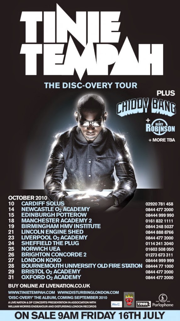
Tinie Tempah
 This tour poster really stood out to me when I was looking through the posters on google images. I think that using the same text that is on the 'Discovery' album helps the audience to recognise the poster as the artists.
I think that the strip across the bottom informing the audience of when the sale is helps emphasise this as important and helps catches the eye of the target audience.
The glow around the artists image helps him stand out and makes him the main focus on the tour poster.
Using a different colour text for the venues where the artist will be playing separates the date of the event and the phone number the audience need to ring to book tickets. This gives the audience a chance to check whether the artist is playing in their local venue before ordering tickets.
I think that this poster is one of the most eye catching and unique that I have seen, and will use this as well as the original to look for inspiration.
Metamorfosis
The lack of image of the artist is a unique approach and they have used a logo to represent them. This makes me think whether I could use a combination of an image of the artist and the logo that we decided to represent him with.
The background and the flowers in each of the top corners gives the tour poster a unique design. This makes the tour poster more eye catching and is a different approach compared to a plain background.
The different colour of text for the band name also helps the band attract a wider target audience as people who have not heard of the band will instantly know what the name of the band is.
However this tour poster is not as specific as the other two. It just states '2012' and does not have any dates or any way of purchasing tickets for the tour. I don't think I will be using this tour poster to help me design my own.


No comments:
Post a Comment